YATBBH - LD41 Postmortem (Part 1)
YATBBH (Yet Another Turn Based Bullet Hell) was my entry to Ludum Dare 41. The theme of the competition was "mix two incompatible genres". My aim in entering the competition was to learn more about game dev, and the purpose of this postmortem will be to try and make the lessons learnt explicit. My entry is available for download on itch, and the source code is available at github.
Game: jf89.itch.io/yatbbh
Code: github.com/jf89/ld41
There are many things one could focus to talk about in a postmortem - the number of choices made in making a game is staggering. So I want to make a number of posts, which otherwise would have been notes to myself, about the most important lessons I've learnt from this project. In this post I'll talk about the graphics.
Graphics
If you had told me I would be pleased with the graphics of my Ludum Dare entry when I started I don't think I would have believed you - I am no artist! However, after the competition, I think the graphics are perfectly acceptable. They are very basic, but are functional, have a consistent style and a consistent colour scheme. In particular, I think the conscious choice to keep to a restricted colour scheme
was a very simple way to drastically increase the quality of what was produced, and something that can easily be replicated in future.
Beyond that, I encountered some issues and suggestions with the graphics which should be addressed in future. The first of these was handling edge cases. In an interactive medium like games it is inevitable that the game will produce some edge cases that were originally unaccounted for. In the case of my game, there are two edge cases which I've noticed crop up that I am unhappy with the handling of. Here is a screenshot showing both:
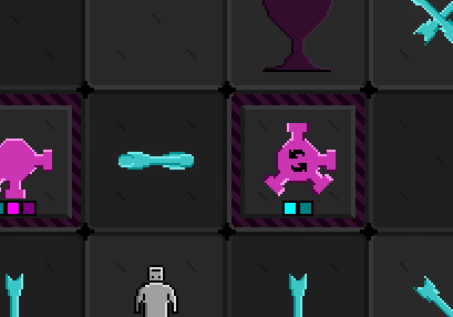
On the left are two overlapping bullets moving in opposite directions. Unforunately here the shape of the bullets does not work well and it is awkward to visually parse this information. On the right in this image is a gun with a timer which really just means "this gun always shoots", which could be more simply shown by having only one stage in the timer (in general, timers can have repeating patterns, which ought to be removed to simplify the player's information).
Unforeseen edge cases like this are by definition not something one can account for beforehand, however, whilst making my entry I did not pay attention to details like this at an earlier stage in development. Instead, I didn't take the time to test for things other than "does this code work", which was a mistake.
The second problem I had with the graphics was how good a job the graphics do of drawing the attention of the player to the important things happening in the game. Here is an example screenshot:
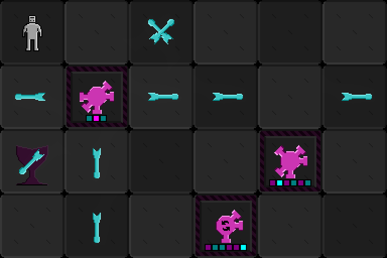
The most important thing in the game is probably the player themself, who is located in the top left here. I think that the robot is sufficiently visually distinct, so this is not a problem. However, the next most important thing the player probably ought to be aware of is the location of the goal, which in this screenshot is two squares down from the player. Unfortunately, I chose to draw the goal in a dark purple colour rather than a light purple, and the goal does not draw the eye well. In addition, a bullet may be located over the goal to further obscure it (this is not really avoidable, but is something I ought to have been aware of).
Other things in the scene of importance are the timers of each of the guns. I think these are quite visually distinct and self explanatory (I've not had anyone leave a comment saying they didn't understand when a gun would fire, or when it would rotate). However, I relied on the timers to give all information about when the guns fire, but neglected that this means there isn't a big visual cue about which guns are firing next turn. This means a common error whilst playing is to move into a square believing it is safe but find out you have overlooked a gun which was going to fire into that square next turn. This could be addressed by the guns changing colour to be brighter when they are going to fire next turn.
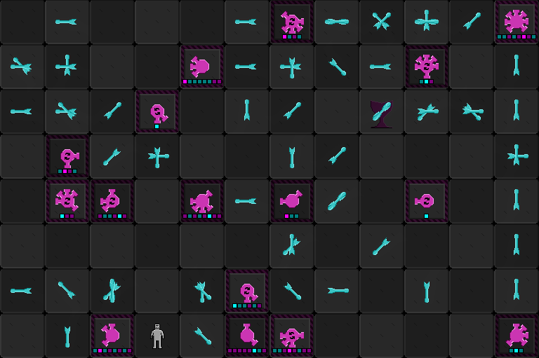
Finally, here is a better screenshot to demonstrate the problem of locating the most important information in the game. As it stands, the first part of the game is a mini-game of where's Waldo to locate the robot and the goal!
Finally, there are no sprite animations in the game, but this would have added a lot. Below is an example of the animations:
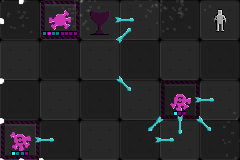
I think in light of how much it would add, I ought to look into learning to animate the robot (and perhaps upgrading the explosion animations from particle effects). We shall see about this in the future!
To summarise the lessons learnt for the future are:
* Use a colour scheme as an easy way of increasing graphics quality;
* Make notes on what important information the graphics need to convey;
* Try hand making animations.
Leave a comment
Log in with itch.io to leave a comment.